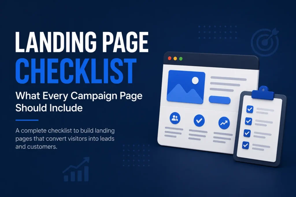
Landing Page Checklist: What Every Campaign Page Should Include
A landing page should focus one audience on one clear action. This checklist explains what every campaign page needs before you send paid traffic, email clicks, social visitors or WhatsApp leads to it.
A landing page has one simple job.
It should help the right visitor understand one offer and take one clear action.
That sounds easy, but many campaign pages fail because they try to do too much. They explain the company, list every service, add too many links, show too many buttons and expect the visitor to figure out the next step.
A landing page is different from a website. A website gives people context. A landing page gives people direction.
When someone clicks an ad, opens an email, scans a QR code, taps a social post or follows a WhatsApp link, they arrive with limited attention. They want to know whether the page matches what they expected. They want the offer to be clear. They want to know why they should care. And if they are interested, they want the next step to be obvious.
A good landing page does not need to be clever. It needs to be focused.
Before you send traffic to any campaign page, make sure it has the right structure.
Start With One Clear Offer
The first mistake businesses make is trying to promote too many things on one landing page.
A campaign page should not behave like a homepage. It should not ask the visitor to choose from ten services. It should not make them browse through your entire business. It should guide them toward one specific offer.
That offer could be a consultation, a webinar, a digital product, a clinic package, a real estate enquiry, a course, a lead magnet or a service audit.
The offer should be clear enough that a visitor can understand it quickly.
If the page is about a website review, keep the page about a website review. If the page is about a landing page service, keep it about landing pages. If the page is about lead capture, do not suddenly shift into branding, SEO, video and social media unless those points directly support the offer.
A focused offer makes the page easier to write, easier to design and easier to improve.
It also makes the visitor’s decision simpler.
Match the Page With the Traffic Source
A landing page should feel like a natural continuation of the click that brought the visitor there.
If an ad says “Get a Website Review,” the landing page should not open with generic agency copy. It should immediately confirm that the visitor has reached the right place.
If a LinkedIn post talks about lead capture, the page should continue that conversation. If an email promotes a webinar, the landing page should make the webinar details clear. If a WhatsApp message shares a service offer, the page should explain that offer without forcing the visitor to search.
This matching is important because people leave quickly when expectations are broken.
The visitor is silently asking:
“Is this the same thing I clicked for?”
Your landing page should answer yes within the first few seconds.
This is why campaign pages should not be generic. They should be written for the specific source, audience and promise that brought people to the page.
Write a Headline That Explains the Outcome
The headline is the most important sentence on the landing page.
It should not be vague. It should not try too hard to sound clever. It should explain what the visitor can get, understand or achieve.
A weak headline says:
“We help businesses grow.”
A stronger headline says:
“Turn website visitors into trackable enquiries.”
The second version is clearer because it tells the visitor what the page is about. It also suggests a practical outcome.
For a landing page, the headline should usually answer one of these questions:
What is being offered?
Who is it for?
What problem does it solve?
What outcome does it support?
The best headline is not always the shortest. It is the one that reduces confusion fastest.
Once the headline is clear, the subheadline can add context. It can explain who the offer is for, what is included or why it matters now.
Explain the Problem Before the Solution
A landing page should not jump straight into selling.
Good pages first make the problem visible.
If you are offering lead capture, explain why traffic is wasted when forms, source tracking and follow-up are weak. If you are offering a landing page design service, explain why sending ad traffic to a generic homepage often fails. If you are offering a website review, explain why a good-looking website can still fail to generate enquiries.
When the visitor sees their problem described clearly, the offer becomes more relevant.
This does not mean the page should be negative or dramatic. It simply means the page should show that you understand the situation.
A useful problem section helps the visitor think:
“This is exactly what is happening with us.”
That moment is important. It builds trust before the page asks for action.
Show What the Visitor Gets
After the problem is clear, the page should explain the offer in simple terms.
Do not rely on broad phrases like “complete solution,” “end-to-end support” or “growth package.” These phrases sound professional, but they often do not explain what the visitor will actually receive.
Be specific.
If the landing page is for a website review, explain what will be reviewed. If it is for a consultation, explain what the call will cover. If it is for a downloadable checklist, explain what the checklist helps with. If it is for a service, explain the main deliverables.
The visitor should not have to guess.
A clear “what you get” section can include the main parts of the offer, but it should not become a long technical list. Keep it practical. Explain the value in buyer language.
For example:
You will get a review of your current page, the main clarity gaps, the missing trust signals and the simplest next step to improve enquiries.
That is more useful than saying:
You will get a strategic digital audit with conversion-oriented recommendations.
Specific language creates confidence.
Add Proof That Feels Believable
Proof is not optional on a landing page.
When a visitor is considering an action, they need a reason to trust the page. That reason can come from past work, testimonials, client names, project screenshots, founder experience, media mentions, examples, numbers or a clear explanation of process.
The proof does not need to be huge. It needs to be relevant.
If you do not have formal case studies yet, use honest proof signals. Show owned projects. Show samples. Show before-and-after thinking. Show the process. Show the type of businesses you have worked with. Show what has been built.
Avoid inflated claims.
A landing page that promises too much can reduce trust.
A landing page that shows specific, believable proof can increase confidence.
For many service businesses, proof can be simple:
We have built and improved business websites, service pages, content systems and lead capture paths for owned and client projects.
That is more credible than saying:
We guarantee 10x growth.
Good proof should support the decision, not distract from it.
Make the CTA Obvious
Every landing page needs one primary call to action.
The CTA should be visible, specific and repeated at important points on the page.
Do not make the visitor wonder what to do next.
A good CTA might say:
Request a Review
Get a Landing Page Plan
Book a Discovery Call
Submit Your Requirement
Download the Checklist
Reserve Your Seat
Ask for a Quote
The CTA should match the offer.
If the page is for a high-consideration service, “Buy Now” may feel too aggressive. “Request a Review” or “Discuss Your Requirement” may work better.
If the page is for a webinar, “Register Now” is clear.
If the page is for a digital product, “Get the Template” may be better than “Submit.”
The CTA is not just a button. It is the next step in the visitor’s decision.
Make it feel safe, clear and relevant.
Keep the Form Simple but Useful
The form is where interest becomes a lead.
Many landing pages lose people at this stage.
Some forms ask too much. Some ask too little. Some look broken. Some have unclear labels. Some submit into an inbox without any source tracking or follow-up process.
A good campaign form should be simple but useful.
For a service enquiry, it can ask for:
Name
Business name
Email or WhatsApp number
Primary need
Short message
That is usually enough for the first step.
You can collect more information later.
The form should also explain what happens after submission. A short reassurance line can help:
No fake guarantees. Clear diagnosis, useful assets and practical next steps.
This kind of line sets expectations. It tells the visitor that the next step is not a hard sales trap.
Remove Unnecessary Distractions
A landing page should reduce choices.
That does not mean the page should feel empty. It means every section should support the same decision.
Avoid adding too many navigation links, unrelated services, long company history, multiple competing CTAs or content that pulls the visitor away from the offer.
If the landing page is part of an ad campaign, you may even reduce the header navigation. For organic or service landing pages, some navigation is fine, but the main page should still stay focused.
Every extra option creates a small decision.
Too many decisions create friction.
A good landing page keeps the visitor on one path.
Answer the Questions That Create Hesitation
People hesitate before they submit a form.
They may wonder whether the service is right for them, whether they will be pressured, whether the price will be too high, whether the business is credible or whether they are ready to start.
A strong landing page answers these concerns before they become objections.
This can be done through short FAQ sections.
For example:
Who is this for?
What happens after I submit the form?
Do I need a full website first?
Can this work for a small business?
How soon can we start?
Will I get a proposal or recommendation?
FAQs should not be added only for SEO. They should answer real decision questions.
Good FAQs make the visitor feel informed.
Informed visitors are more likely to take action.
Connect the Page to Follow-Up
A landing page is not complete when the form is submitted.
The follow-up process matters.
If a lead comes in and nobody responds quickly, the campaign loses value. If the enquiry is stored without context, the team may not know what the person wanted. If all leads receive the same reply, serious buyers may feel ignored.
Before launching the page, decide what happens after submission.
Who receives the lead?
Where is it stored?
What source is recorded?
What message is sent?
Who follows up?
How soon?
What is the next step?
This is where landing page design and lead capture come together.
The page creates interest.
The system handles the opportunity.
A Practical Landing Page Checklist
Before sending traffic to a landing page, review the basics.
The page should have one clear offer.
The headline should explain the outcome.
The opening should match the traffic source.
The problem should be easy to recognise.
The offer should be specific.
The proof should feel believable.
The CTA should be clear.
The form should be simple.
The page should remove unnecessary distractions.
FAQs should answer real buyer hesitation.
Lead source and follow-up should be ready.
This checklist is not about making the page longer.
It is about making the page more useful.
A short page can work if the offer is simple and the visitor already trusts you.
A longer page may be needed if the service is expensive, new, complex or trust-heavy.
The right length depends on the decision the visitor needs to make.
When a Landing Page Is Ready to Launch
A landing page is ready when a visitor can understand three things quickly.
First, what is being offered.
Second, why it matters.
Third, what to do next.
If those three things are unclear, do not send traffic yet.
Fix the page first.
Paid ads, social posts, email campaigns and WhatsApp messages will not solve a weak page. They will only send more people into confusion.
A landing page does not need to be perfect. But it should be clear enough to test.
Once traffic starts coming in, you can improve the headline, sections, proof, CTA and form based on real behaviour.
The first version should be clear.
The next versions should be smarter.
Final Takeaway
A landing page is not a smaller website.
It is a focused path for one audience, one offer and one action.
It should match the traffic source, explain the offer, show proof, answer hesitation and make the next step obvious.
Before spending on ads or pushing a campaign, make sure the page can receive attention properly.
Traffic is valuable only when the page knows what to do with it.
A strong landing page turns attention into action.
A weak landing page turns traffic into waste.
Need Help Building a Campaign Landing Page?
If your landing page, offer or lead capture path feels unclear, Design Wiz Tech can help you structure it before you send traffic.
Share your current campaign idea, page or offer. We will suggest the smallest useful improvement.
Need help building a focused campaign landing page?
Read next

AI Jobs in India 2026: Fastest-Growing Roles, Non-Coding Careers and Skills Employers Want
AI jobs in India are changing fast. Here is a practical guide to the fastest-growing AI roles, non-coding AI careers, skills employers want and what professionals, freelancers and small businesses should do next.
Read article
What Makes a Service Page SEO-Friendly and Useful for Buyers?
A strong service page should not be written only for search engines. It should help buyers understand the service, compare options, trust the business and take the next step. Here is what makes a service page both SEO-friendly and useful.
Read article
Why Lead Capture Should Be Built Before You Spend on Ads
Before spending on ads, a business should know how it will capture, qualify and follow up with leads. Without a clear lead capture system, paid traffic can create attention without turning it into useful enquiries.
Read article