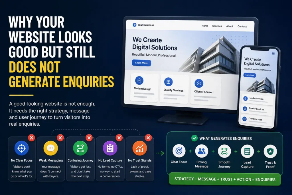
Why Your Website Looks Good But Still Does Not Generate Enquiries
A good-looking website is not always a good business website. If visitors are not enquiring, the problem may be unclear positioning, weak service pages, poor proof, confusing calls to action or missing lead capture. Here is how to diagnose the issue.
Many business owners think their website problem is design.
The website looks old, so they redesign it.
The homepage feels boring, so they add new visuals.
The colours do not feel premium, so they change the brand palette.
The layout looks basic, so they add animations, icons, sections and effects.
After all this, the website may look better.
But enquiries still do not come.
This is a common problem.
A website can look modern and still fail as a business asset.
It can have good typography, clean spacing, nice colours and smooth animations, but still not help a visitor understand what the business does, why it matters and what to do next.
The problem is not always visual design.
Often, the real problem is clarity.
A good-looking website gets attention.
A good business website creates understanding, trust and action.
That is the difference.
A Website Is Not Just a Digital Brochure
Many websites are still built like brochures.
They introduce the company, list services, add a few images, show a contact form and hope visitors will enquire.
But online visitors behave differently.
They scan quickly.
They compare options.
They look for signals of credibility.
They want to know whether your service is relevant to their problem.
They do not want to decode vague language.
They do not want to search for basic information.
They do not want to guess what happens after they contact you.
A business website should answer questions before the visitor has to ask them.
It should make the next step obvious.
If your website only looks good but does not explain the business clearly, it becomes a polished brochure, not a working growth system.
The Real Job of a Business Website
The job of a business website is not only to impress.
Its real job is to help the right visitor move from confusion to confidence.
A useful business website should help visitors understand:
- What you do
- Who you help
- What problems you solve
- What services you offer
- Why they should trust you
- What makes your approach different
- What they should do next
If these questions are not answered clearly, design alone cannot fix the problem.
A good website should reduce friction.
It should make people think:
This is relevant to me.
This business understands my problem.
I can trust them enough to take the next step.
That is when enquiries start becoming more likely.
Reason 1: Your Homepage Is Too Vague
Many homepages open with broad statements like:
- We help businesses grow
- We create digital solutions
- We are your trusted partner
- We deliver innovation
- We transform your business
These lines sound professional, but they often say very little.
A visitor should not have to think hard to understand what you do.
Your homepage should make the basics clear quickly:
- What type of business are you?
- What do you offer?
- Who is it for?
- What outcome do you help create?
- What should the visitor explore next?
A vague homepage creates doubt.
A clear homepage creates direction.
If your homepage does not explain the business in simple language, visitors may leave even if the design looks impressive.
A better homepage should answer
- What does this business do?
- Who is the ideal customer?
- What problem does it solve?
- What service should I click first?
- Why should I continue reading?
If your homepage cannot answer these questions in the first few seconds, it may be attractive but ineffective.
Reason 2: Your Service Pages Are Weak or Missing
Many websites have a “Services” page that lists everything in one place.
This creates a problem.
A visitor interested in one service has to read through many unrelated services before finding what matters to them.
Search engines also struggle to understand each service clearly.
For most service businesses, each important offer should have its own page.
For example:
- Website design services
- Landing page design services
- SEO content pages
- Lead capture systems
- Video production services
- UI/UX design services
Each service page should explain one offer properly.
A useful service page should include:
- Who the service is for
- What problem it solves
- What is included
- How the process works
- What proof supports the offer
- What action the visitor should take
If your services are only listed in a short section, the website may not give enough confidence for someone to enquire.
A service page is not just an information page.
It is a decision page.
Reason 3: The Website Does Not Show Enough Proof
People do not enquire only because you say you are good.
They enquire when they see enough reason to trust you.
Proof does not always mean a large case study.
It can include:
- Past work
- Project references
- Client examples
- Before and after improvements
- Testimonials
- Screenshots
- Process explanation
- Founder credibility
- Published content
- Real business outcomes
Many good-looking websites lack proof.
They use polished copy but do not show enough evidence.
This creates a trust gap.
The visitor may like the website, but still wonder:
Has this business done this before?
Can they solve my problem?
Is this credible enough to contact?
If the answer is unclear, they may not enquire.
Proof should be specific
Weak proof says:
“We have helped many clients grow.”
Better proof says:
“We redesigned service pages, improved enquiry paths and created a clearer lead capture flow for a B2B service business.”
Specific proof feels more believable.
Generic proof feels like marketing language.
Reason 4: The Call to Action Is Not Clear
A website may have buttons, but that does not mean it has a clear call to action.
Common CTA problems include:
- Too many different CTAs
- Vague button text
- Buttons placed too late
- No CTA after important sections
- Contact page hidden in the menu
- Form too long or unclear
- No explanation of what happens next
Buttons like “Submit” or “Learn More” are often weak.
The visitor should know what action they are taking.
Better CTAs are more specific:
- Request a Website Review
- Get a Landing Page Plan
- Discuss Lead Capture
- Book a Discovery Call
- Share Your Requirement
- Ask for a Quote
The CTA should match the visitor’s stage.
A new visitor may not be ready to “Buy Now”, but they may be ready to request a review or share their problem.
A clear CTA reduces hesitation.
Reason 5: The Lead Capture Path Is Broken
Lead capture is where website interest becomes a business opportunity.
Many websites fail here.
The form exists, but the flow is weak.
Common lead capture problems include:
- The form asks too much too soon
- The form asks too little to qualify the lead
- There is no WhatsApp option
- There is no confirmation message
- Leads are not stored properly
- The team does not know where leads came from
- There is no follow-up workflow
- The same form is used for every page
A contact form is not a lead capture system.
A lead capture system should help you understand:
- Who contacted you
- What they need
- Where they came from
- Which page they used
- What should happen next
If traffic is coming but enquiries are weak, the problem may be the path, not the traffic.
Reason 6: The Website Is Designed for the Business, Not the Buyer
Many websites are written from the company’s point of view.
They say:
- We are experienced
- We are passionate
- We offer many services
- We believe in quality
- We use the latest technology
There is nothing wrong with this, but the buyer is usually thinking about their own problem.
They want to know:
- Can you solve my issue?
- Have you worked on something similar?
- What will I get?
- How much effort is needed?
- How soon can we start?
- What happens after I contact you?
Your website should speak to the buyer’s questions.
A good business website does not only say what you do.
It helps the buyer understand why it matters to them.
Reason 7: The Website Has No Content Strategy
Some websites have service pages but no supporting content.
This makes the site thin.
A useful website should build authority over time.
That can happen through:
- Blog posts
- Insight articles
- FAQs
- Guides
- Explainers
- Comparison articles
- Use-case pages
- Industry-specific pages
For example, a website design company should not only have a “Website Design Services” page.
It can also publish articles like:
- Website vs Landing Page: Which One Does Your Business Need First?
- Why Your Website Looks Good But Still Does Not Generate Enquiries
- What Makes a Service Page SEO-Friendly and Useful for Buyers?
- Landing Page Checklist: What Every Campaign Page Should Include
This type of content helps buyers understand their problem before they enquire.
It also supports SEO.
A website without content may depend only on referrals, ads or direct visits.
A website with useful content can slowly build organic discovery.
Reason 8: The Website Is Not Built Around a Clear Journey
A visitor journey is the path someone takes through your website.
For example:
Homepage
Service page
Proof section
Article
Contact form
Or:
LinkedIn post
Blog article
Related service page
Lead capture form
Or:
Google search
SEO content page
Service page
Request review CTA
If your website does not guide people through a journey, they may browse and leave.
A strong website connects pages logically.
It uses internal links, related sections and CTAs to move visitors toward the next useful step.
The goal is not to trap people.
The goal is to make the path easier.
A website that has no journey feels like a collection of pages.
A website with a clear journey feels like a system.
How to Diagnose Your Website
If your website looks good but does not generate enquiries, review it section by section.
Check your homepage
Ask:
- Is the main message clear?
- Can a visitor understand what we do in five seconds?
- Are the main services easy to find?
- Is the first CTA clear?
- Is there enough proof?
Check your service pages
Ask:
- Does each main service have its own page?
- Does each page explain the problem, offer and outcome?
- Is the page useful even before someone contacts us?
- Does the page answer buyer questions?
- Is there a clear CTA?
Check your proof
Ask:
- Do we show real work or references?
- Are claims supported by examples?
- Do we explain our process?
- Do we show enough credibility?
Check your lead capture
Ask:
- Is the form easy to find?
- Is the form simple but useful?
- Are leads stored properly?
- Do we know the source of each lead?
- Is there a follow-up process?
Check your content
Ask:
- Do we answer common buyer questions?
- Do we have useful articles or guides?
- Do our pages support SEO?
- Are pages connected through internal links?
This diagnosis is more useful than simply asking, “Does the website look good?”
What a Better Website System Looks Like
A better website system usually has five layers.
1. Clear positioning
The website should explain what the business does, who it helps and why it is relevant.
2. Strong service pages
Each important offer should have its own page with clear copy, proof and CTA.
3. Trust signals
The website should show work, references, testimonials, process or founder credibility.
4. Useful content
Articles, FAQs and guides should help buyers understand their problem and discover the business through search.
5. Lead capture
Forms, WhatsApp paths, source tracking and follow-up should turn attention into opportunities.
When these layers work together, the website becomes more than a brochure.
It becomes a business system.
Design Still Matters, But It Is Not Enough
Design is important.
A poorly designed website can reduce trust.
Bad spacing, broken mobile layouts, slow pages and confusing interfaces can hurt enquiries.
But design is only one part of the system.
A good-looking website still needs:
- Clear strategy
- Strong copy
- Useful structure
- Service clarity
- Proof
- SEO foundations
- Lead capture
- Follow-up
A website that only looks good may win attention.
A website that is clear, useful and trustworthy can generate enquiries.
That is the real goal.
Final Takeaway
If your website looks good but does not generate enquiries, do not rush into another redesign.
First, diagnose the actual problem.
It may be unclear positioning.
It may be weak service pages.
It may be missing proof.
It may be poor lead capture.
It may be lack of useful content.
It may be a broken visitor journey.
The solution is not always a prettier website.
The solution is often a clearer website system.
One that explains the business, builds trust and makes the next step easy.
A website should not just look good.
It should help the right people understand, trust and contact you.
Need Help Reviewing Your Website?
If your website looks fine but still does not generate enough enquiries, Design Wiz Tech can help you identify what is missing.
Share your current website, offer or lead problem. We will suggest the smallest useful improvement.
Need help finding why your website is not generating enquiries?
Read next

AI Jobs in India 2026: Fastest-Growing Roles, Non-Coding Careers and Skills Employers Want
AI jobs in India are changing fast. Here is a practical guide to the fastest-growing AI roles, non-coding AI careers, skills employers want and what professionals, freelancers and small businesses should do next.
Read article
Landing Page Checklist: What Every Campaign Page Should Include
A landing page should focus one audience on one clear action. This checklist explains what every campaign page needs before you send paid traffic, email clicks, social visitors or WhatsApp leads to it.
Read article
What Makes a Service Page SEO-Friendly and Useful for Buyers?
A strong service page should not be written only for search engines. It should help buyers understand the service, compare options, trust the business and take the next step. Here is what makes a service page both SEO-friendly and useful.
Read article